Salon Mimmi - Conversion-Focused Salon Website
Conversion-focused, analytics-driven salon website.
Visit the live project →Salon Mimmi is a modern, mobile-first website built for a hair salon in Upplands Väsby, Sweden. The focus was on clarity, trust, and conversion: making it easy for visitors to understand the salon's services and book an appointment with minimal friction. The site is designed around clear calls to action, especially booking, with a strong emphasis on usability on mobile devices.
Client-Side Experience
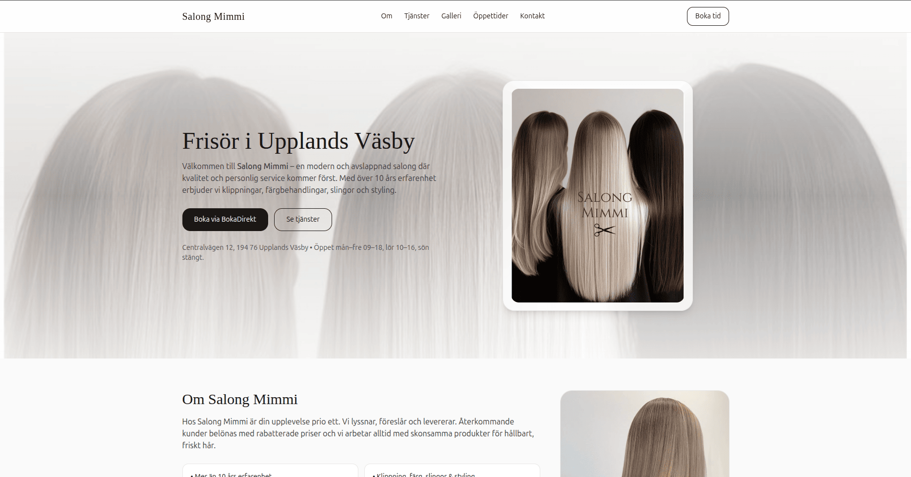
When a visitor lands on the site, they are immediately met with a clear value proposition: who the salon is, where it's located, and what services are offered. The homepage is intentionally designed around action clarity, with a primary focus on booking and secondary actions for exploring services and pricing. Clear opening hours and location information are provided without requiring visitors to hunt for details.
Visitors can:
- Browse services and prices in a structured, readable way
- View a visual gallery of real salon work
- Read verified customer reviews pulled from BokaDirekt
- Quickly jump to booking with minimal friction
The layout is mobile-first, since most bookings happen on phones. Buttons are large, readable, and positioned exactly where users expect them. Everything is designed to reduce hesitation and move users toward booking naturally.
UX Tracking & Behavior Insights
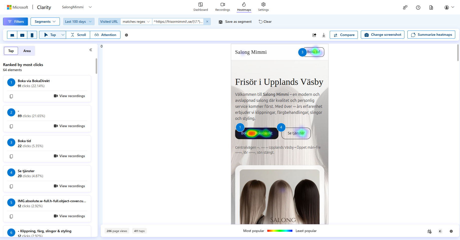
To avoid guessing, Microsoft Clarity was implemented to track real user behavior. This provided heatmaps showing where users actually click, scroll-depth analysis to see what content gets ignored, and session recordings to identify hesitation or friction points.
From the data:
- The primary booking CTA was the most clicked element
- Users interacted far more with direct actions than long text
- Mobile behavior strongly influenced layout decisions
This turned the project from "a nice website" into a measured, data-driven UX build.
Services, Pricing & Gallery
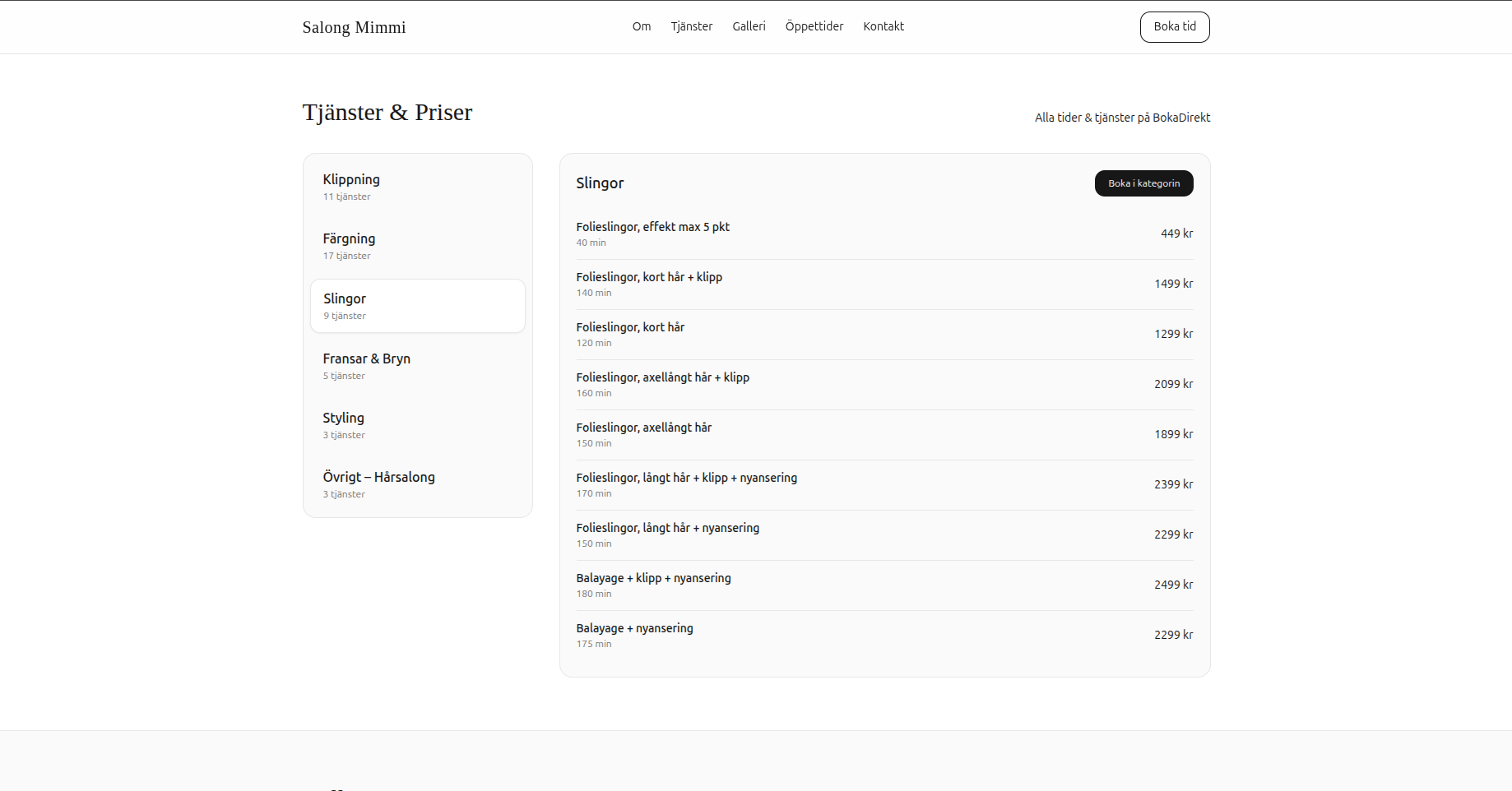
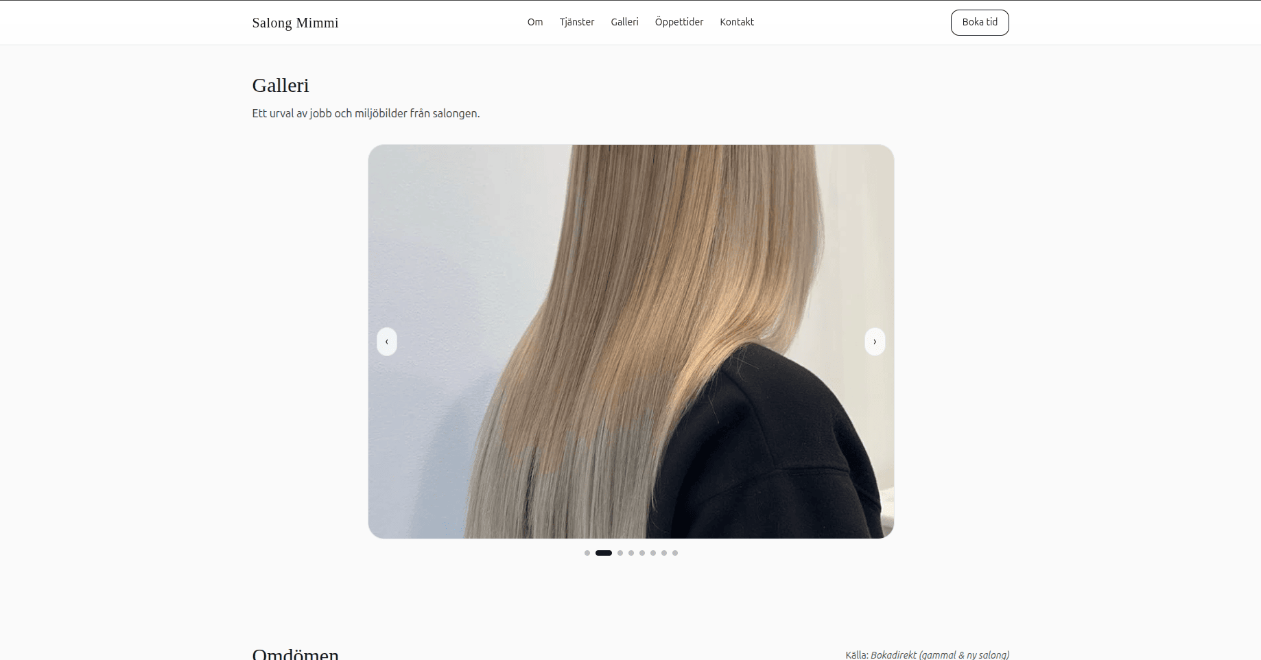
The services and pricing section is designed for clarity and scannability. A clear information hierarchy ensures users quickly find what they need. The gallery showcases real client work, building trust and demonstrating the salon's quality. Customer reviews are integrated throughout, providing social proof at critical decision points.
Technology & Implementation
The tech stack was kept intentionally simple and focused on performance and maintainability:
- Frontend: React (JSX components) for modularity
- Styling: Tailwind CSS for rapid, consistent design
- Build/Dev: Vite for fast development and optimized builds
- Hosting: Render (static) for reliability and simplicity
- Analytics: Microsoft Clarity for UX insights
Performance was prioritized: lightweight assets ensure fast load times across all devices. No overengineering, just the right tools for the job.
Outcome
The result is a focused salon website that puts booking and mobile use first, with analytics available to inform later design decisions and give the client visibility into visitor behaviour.
The project demonstrates UX thinking, analytics literacy and practical client work in a compact booking-focused website.